Clever logos with that extra level of distinction and relevance.
The challenge for Base Design was how to turn corporate elevator company, Mitsulift, into a relevant, contemporary brand. While the logo does a great job of capturing the idea, the real strength is in the broader identity.

Australian Design Radio was given a clever, Australia-shaped mark by Christopher Doyle & Co. When the radio’s on-air the graphic equaliser moves, returning to the original form when off-air.

Originally built for freight trains in the 1930s, The High Line is an elevated rail structure on Manhattan’s West Side that has been turned into the city’s most popular new park. An ideal monogram by Paula Scher, Pentagram.

New Chapter is a startup offering word therapy — a form of counselling where participants express themselves through the written word. The symbol, by Paul Belford Ltd, combines a book with a forward-pointing arrow.

The Pregnancy Pause is a fictitious company created and designed by Mother NY, because maternity leave is a full-time job.

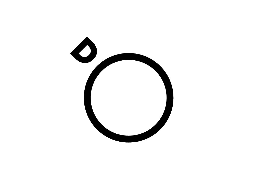
Inspired by the “Overview Effect” — a sensation that astronauts experience when given the opportunity to look down and view the Earth as a whole — Daily Overview offers a new way to look at the landscape humans have shaped. The D overlooking the O creates a very apt monogram from the now seemingly defunct Brooklyn-based Fleet.

Freedom Travel had always had a gull on their logo and they wanted a gull on the new one. The Chase obliged them.

Paws is a personalised dog food delivery service in the UK, with a charming logo designed by Koto.

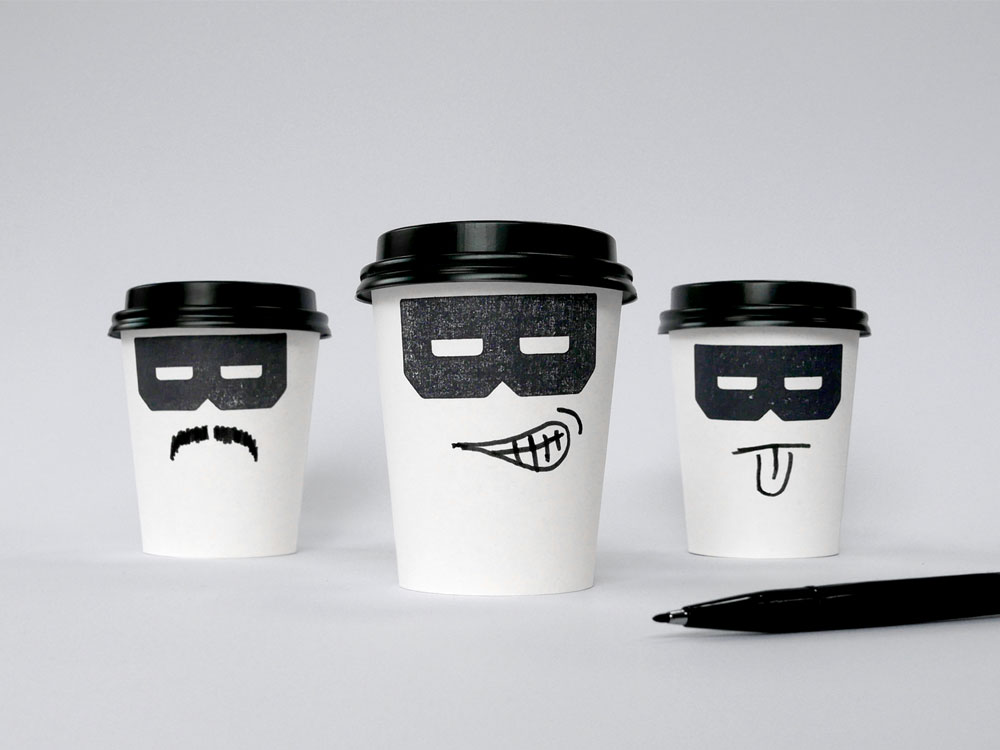
The Bandido coffee brand “channels the Californian counterculture spirit by bucking the system of larger coffee chains and corporates.” The playful mark designed by Magpie is fitting and memorable.
Source: Logo Design Love


